Feministic Alphabet
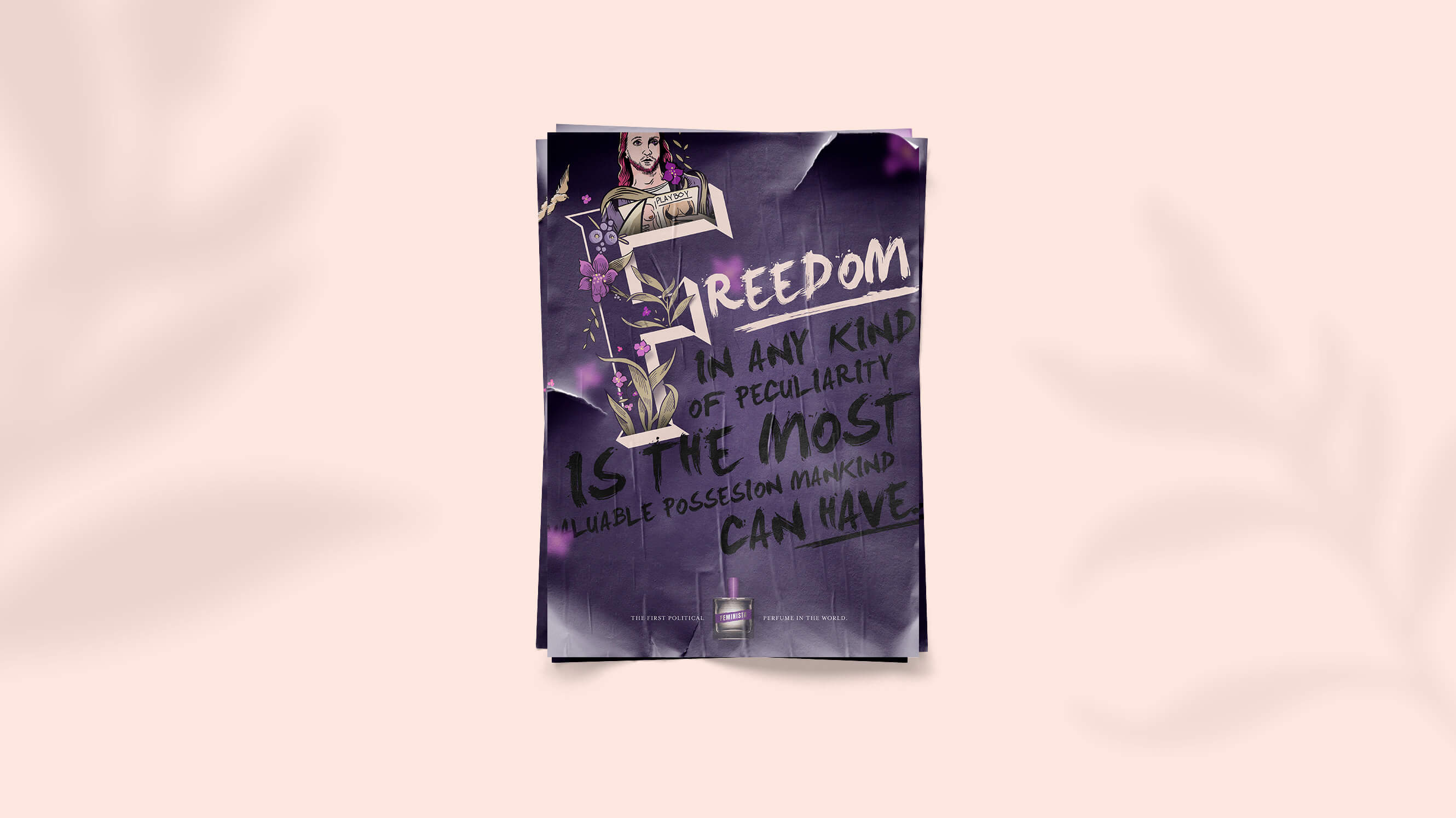
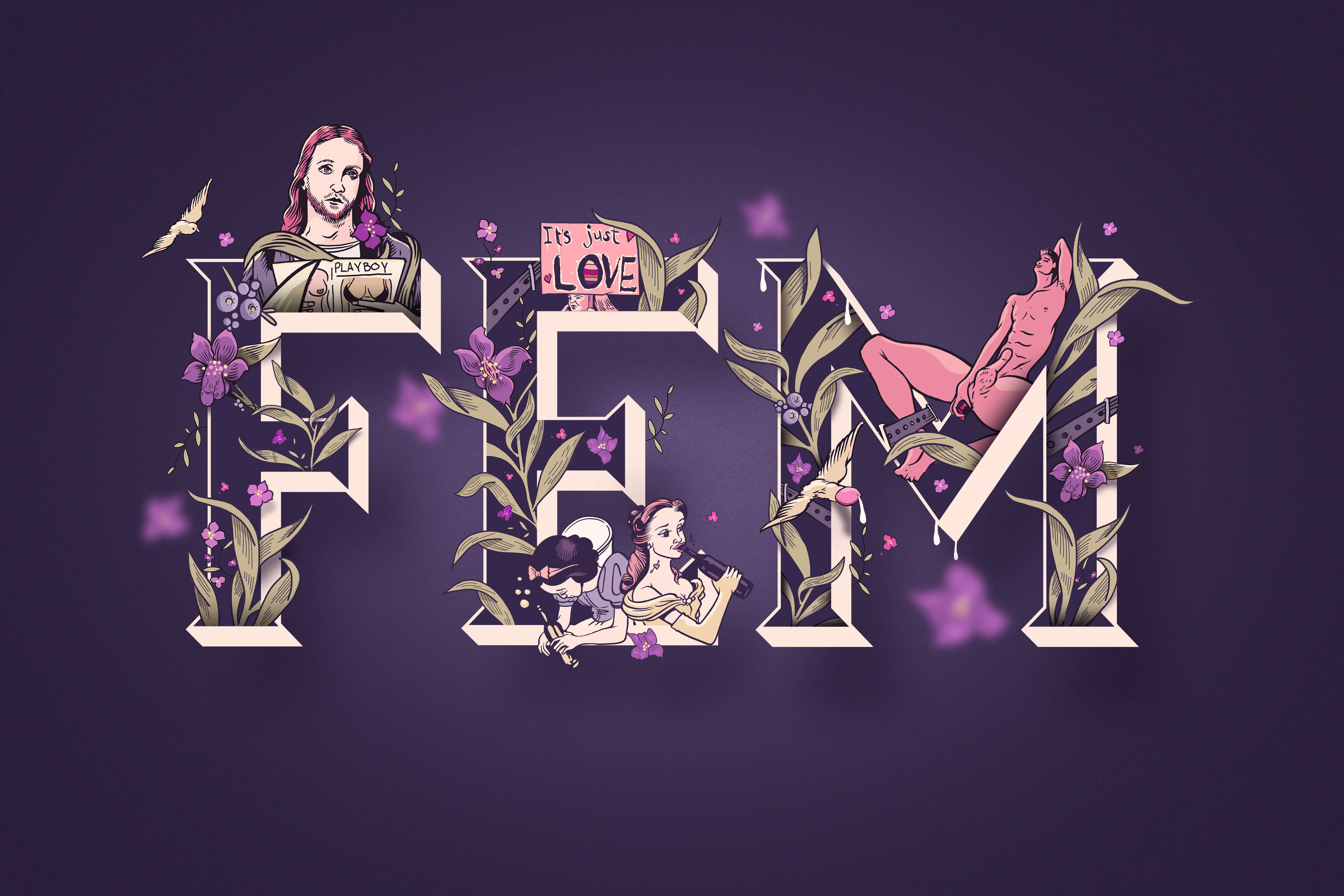
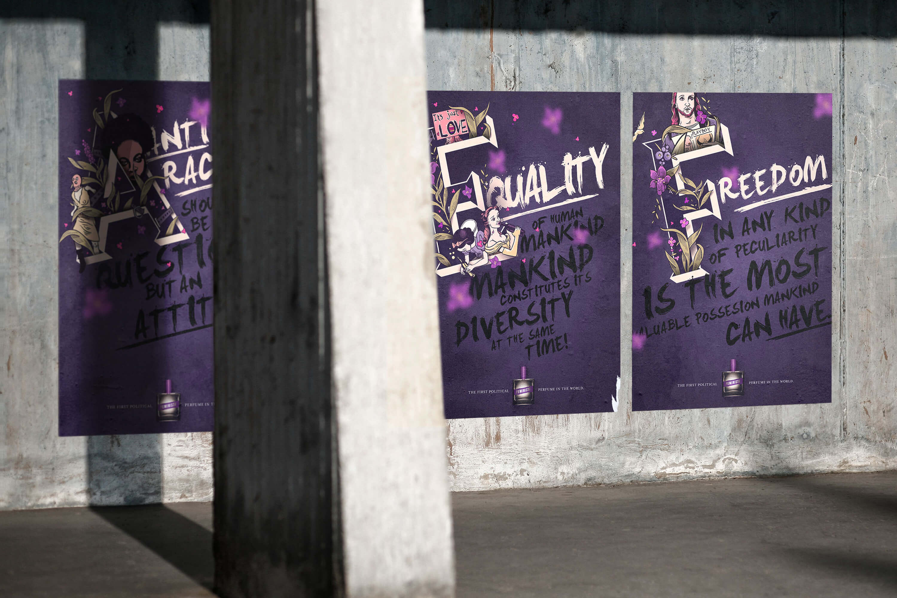
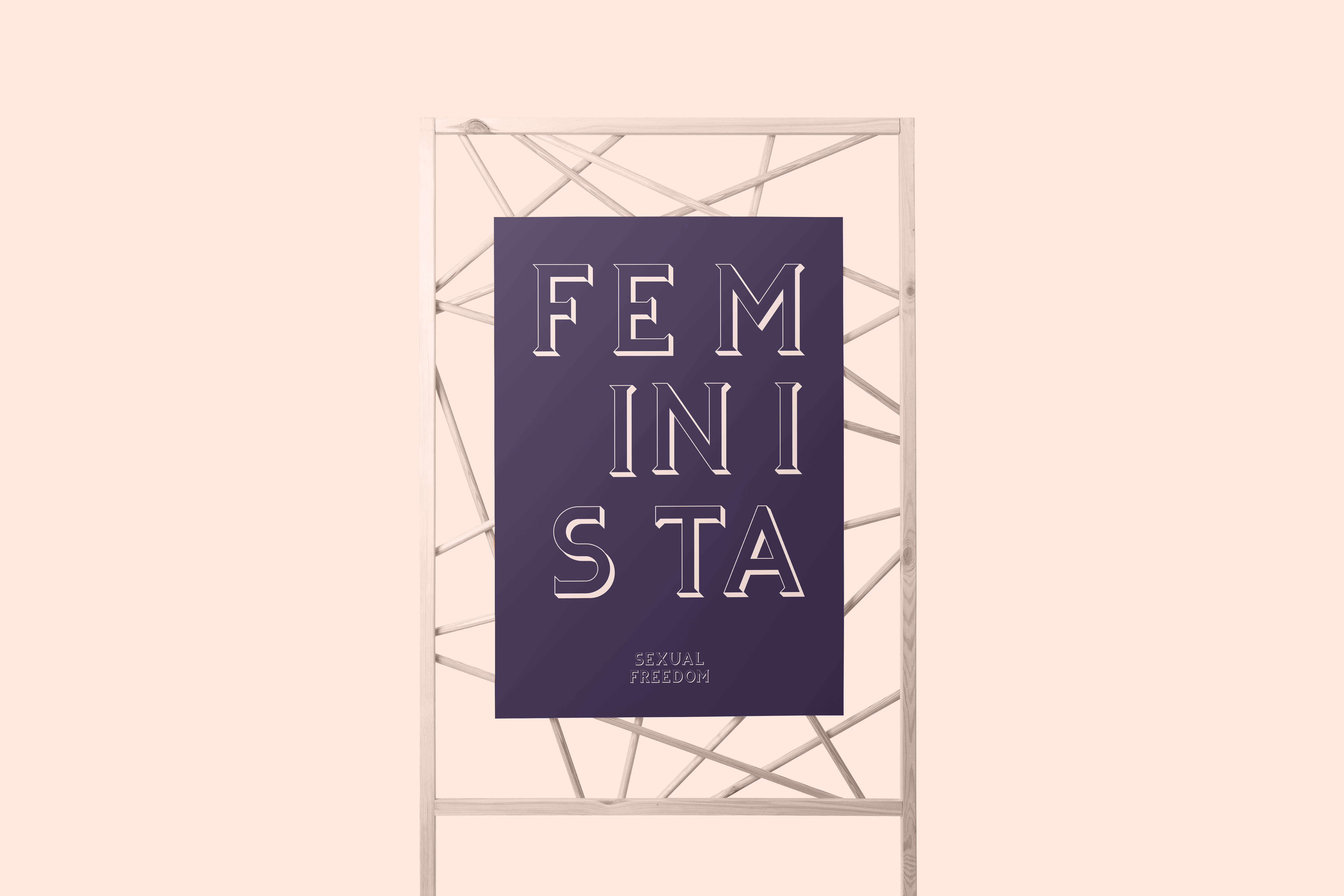
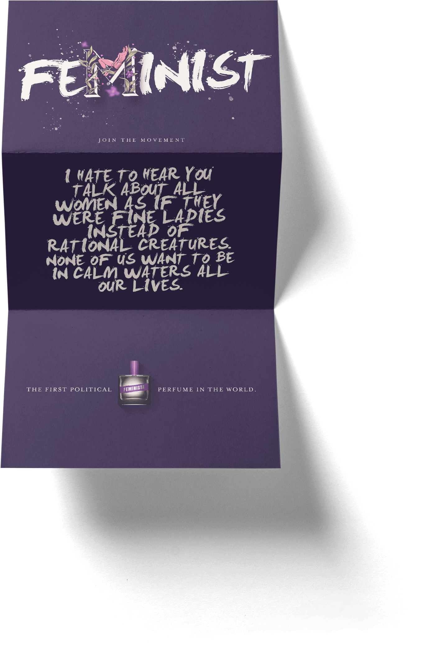
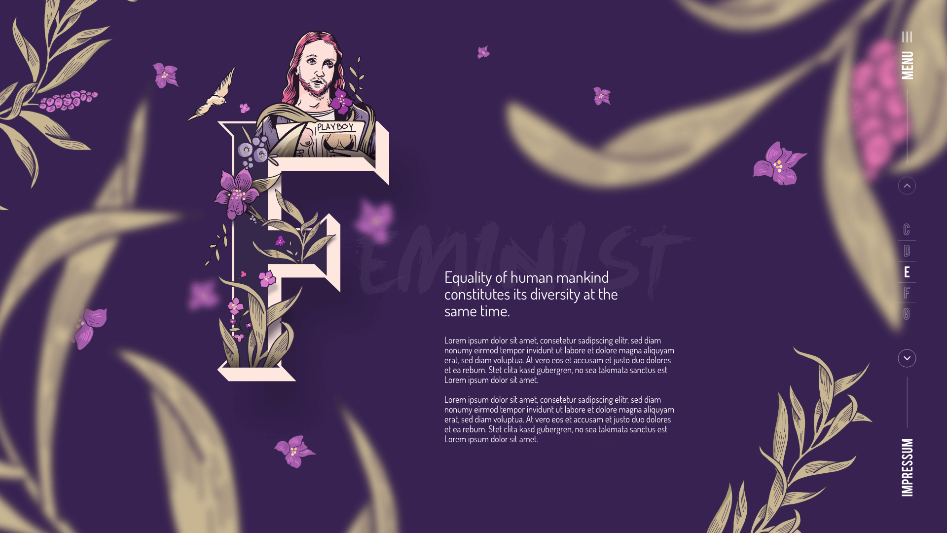
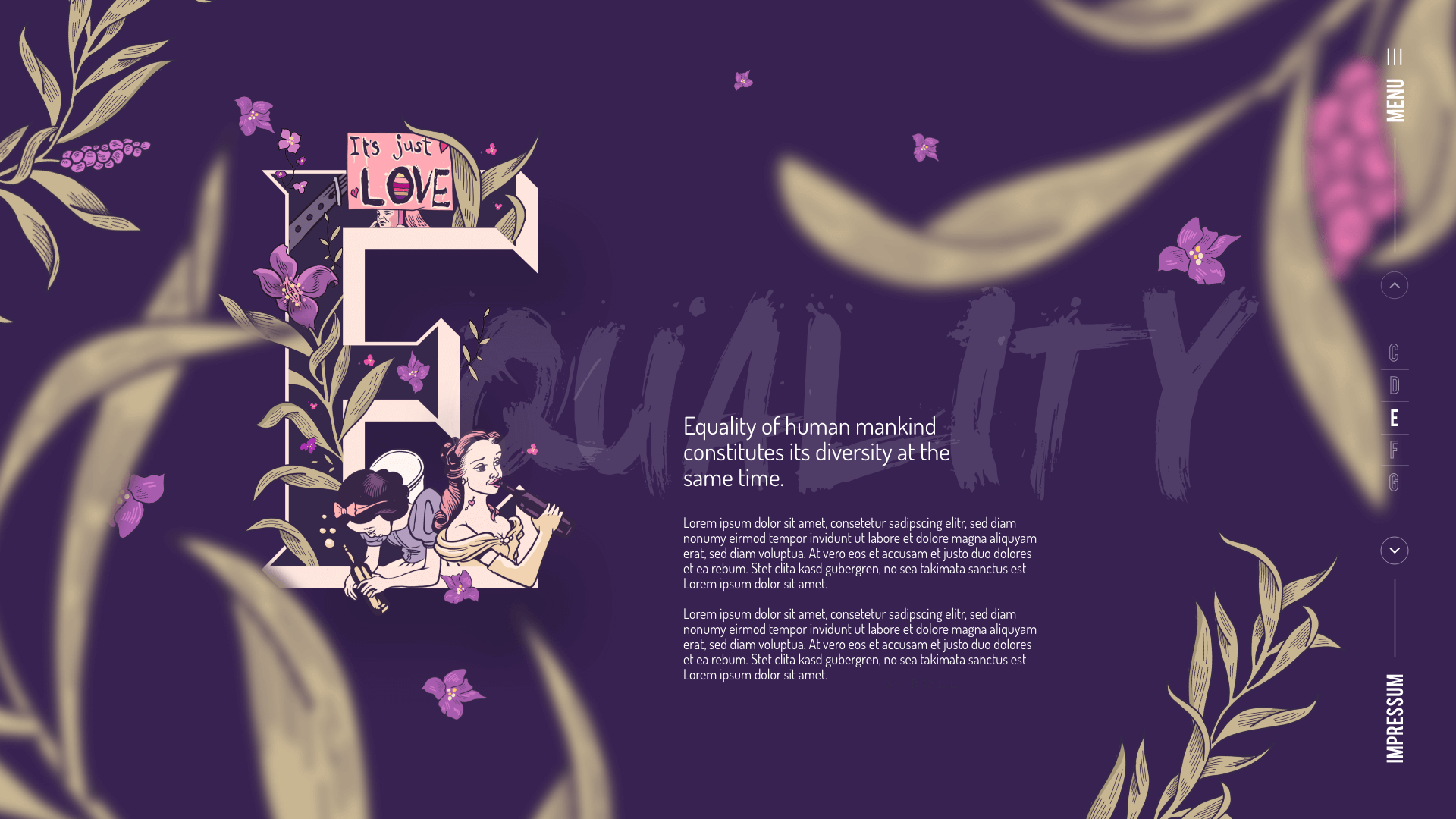
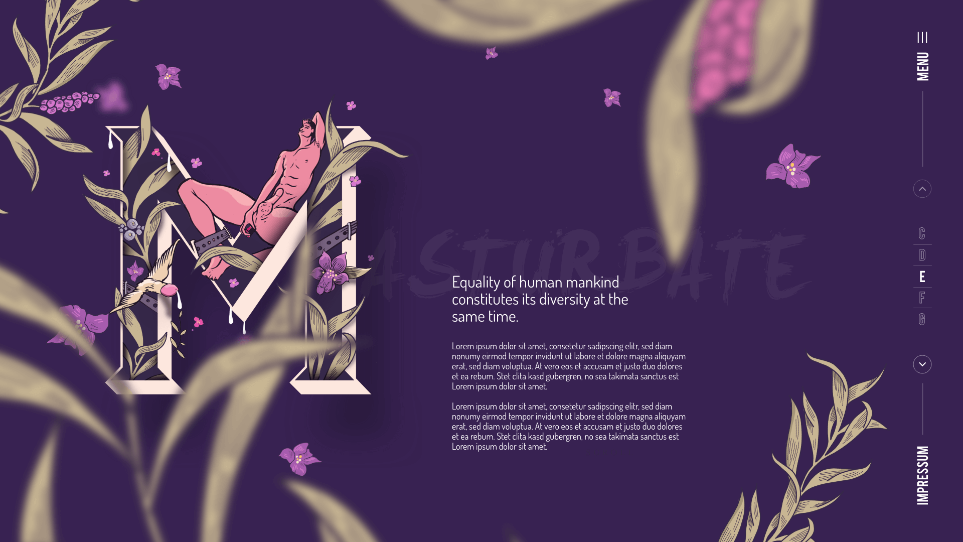
The essence of feminism cannot be captured, it was said. Feminista is the world's first political perfume and proof that it works. But how can a corporate design reflect its complexity? With a font that makes a clear statement. A manifesto that immerses the viewer intensively and actively in the world of feminism and brings its essence to life.
AGENCY
Serviceplan Munich
MY TASKS
Concept, Typography Illustration, Poster Design, creating the visual design language
DATE
February 2020
About
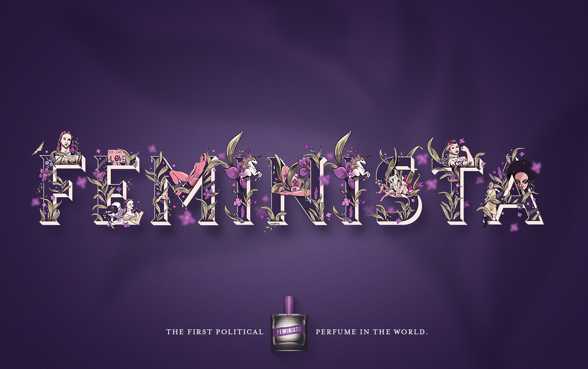
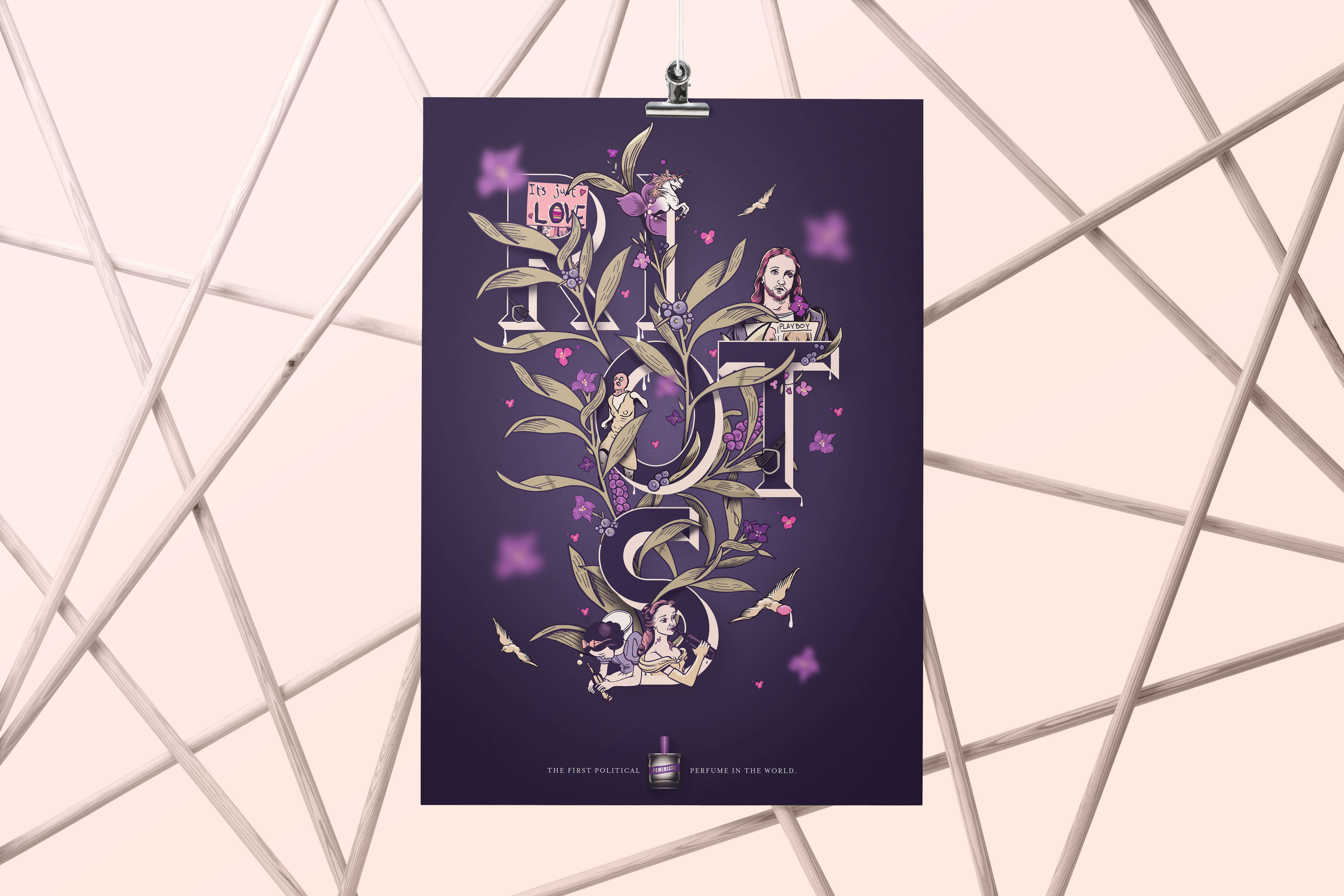
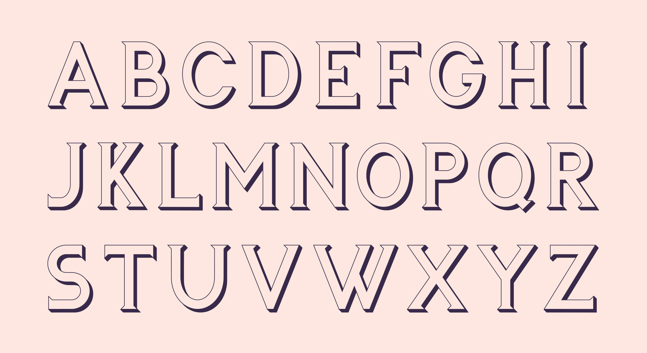
The illustrative Initial Font potentiates the strong power of the Manifesto, inspired by the ingredients of the perfume itself, as well as the visual interpretations of feminism. The new CD is uncompromising, authentic, individual and direct - like Feminista herself.
Typography
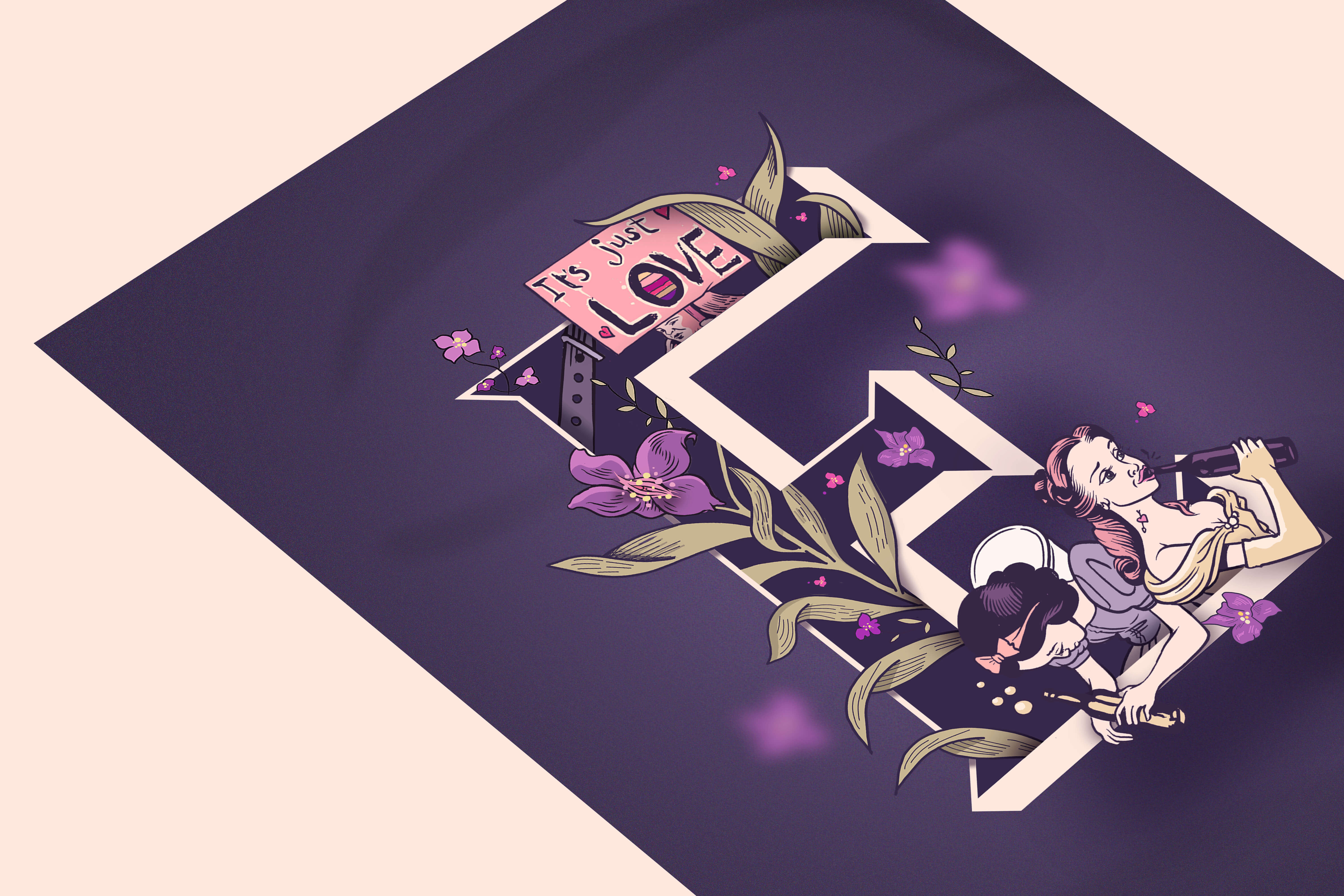
The illustrative Initial Font potentiates the strong power of the Manifesto, inspired by the ingredients of the perfume itself, as well as the visual interpretations of feminism. The new CD is uncompromising, authentic, individual and direct - like Feminista herself.


Webdesign
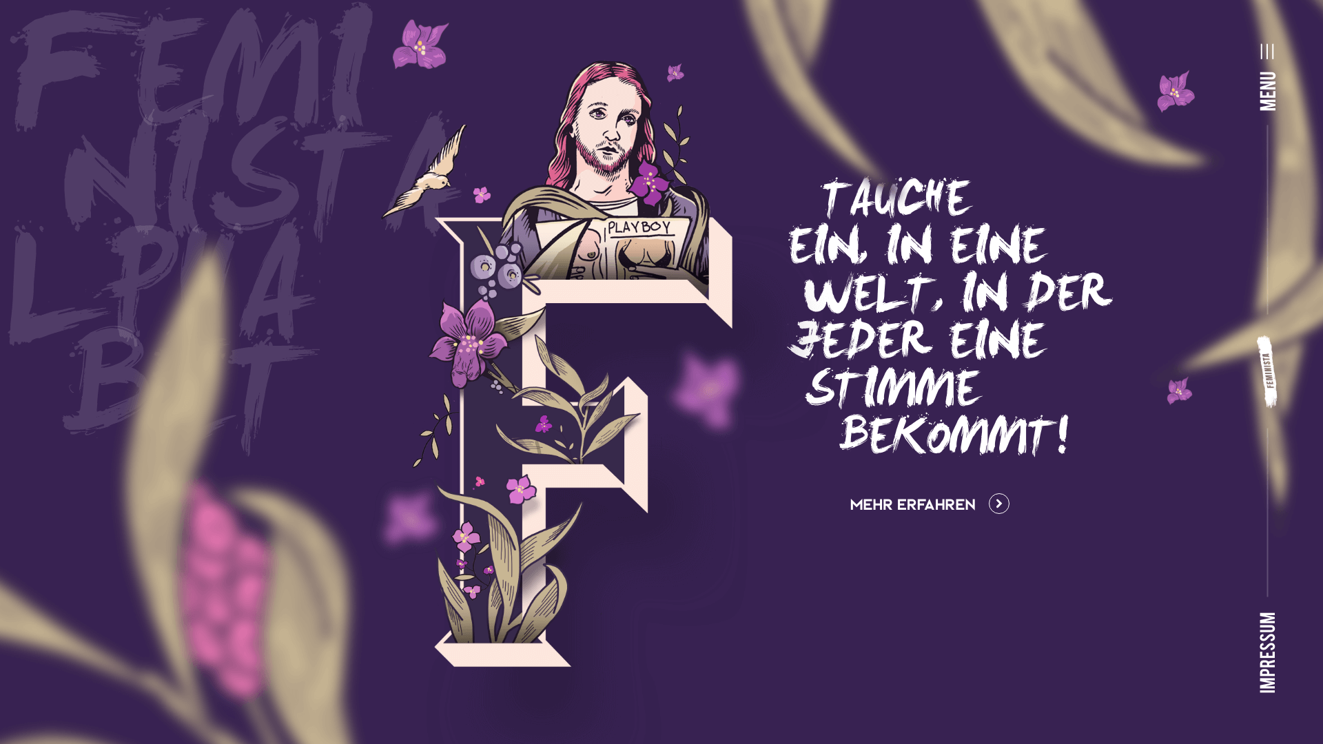
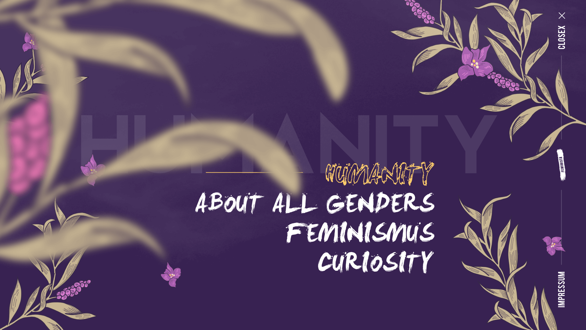
A visit to the website should also reflect the tonality and uniqueness of the perfume. So you don't scroll down or up, from left to right or vice versa, you scroll in depth and discover the world of feminism and perfume. The website is kept very dark and skilfully uses the illustrations from the CI/CD. This creates a unique experience where many visitors get stuck.
Portfolio von Philipp Mandler
Philipp Mandler
Portfolio von Philipp Mandler
Behance – Instagram - Ello
Behance – Instagram - Ello
Behance – Instagram - Ello
